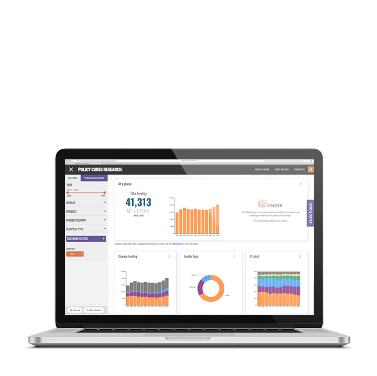
Policy Cures Research Data Visualisation Web Application
Policy Cures Research is a global health think tank with a long and pioneering history in global health R&D data collection and analysis and a trusted source of quality evidence within the sector. Their G-FINDER project tracks annual investment in R&D for new products and technologies designed to address the persistent global health challenges that disproportionately affect the world’s most disadvantaged people. Their goal is to provide an accurate understanding of the R&D funding landscape for neglected diseases and other global health priorities. The G-FINDER data portal provides open access to all of the underlying data captured by the G-FINDER survey. Policy Cures Research wanted to visually represent their data analysis and allow customisable links between the criteria.
Issues
- Load time of data-heavy graphs and tables with dynamic layout
- No data aggregation had been performed on the PCR database previously, which meant that we could not easily translate the data into graphs
- PCR had a unique set of requirements around what sort of graphs were required, which discounted the majority of graphing tools available
- PCR had special conditions around filtering of data which affected how we were able to aggregate the data
Objectives
- Create an easy to use, easy to understand web application that will allow custom data visualisations to be created based on selected options
- Data visualisations will map up to existing data
- Data visualisations will be available in various formats (multiple graph formats and tables) and be able to export (jpg and xlsx)
- Allow the current view to be shared with others via link (remembering all filter selections and visualisations)
- Allow PCR to create pre-built dashboard configurations
Research
The main hurdle to overcome with this project was the sheer amount of data that had to be translated into a usable state for the graphs. We worked extensively with PCR to amend the dataset to be used by the many graphs and ensure that we represented all data correctly. We completed several rounds of UI prototype designs to ensure that our design did not hinder the tool’s usability. We utilised a React-based approach for this web application as it was able to create reusable components easily and quickly. This approach also meant that we could make further changes to the configuration and add on more modules when required without issue. We also consulted with PCR to find a graphing tool that would meet their requirements and had the ability to be extended and customised. We created custom functionality that would allow users to share the dashboard and filter selections they had made and allowed PCR to create custom dashboards which are accessible from a shareable link. During development, we performed extensive tests on the server-side and client-side to decrease site load times.
Conclusions
The Policy Cures Research data visualisation web application was a large project that had many working parts and numerous technical challenges. The frequent collaboration between PCR and Erudite meant an Agile approach to the project was required. This meant we were able to achieve our goals of creating an easy to use and understand application to represent the data visualisations. The project was also very high-profile for PCR with it being launched via a presentation to the WHO and Bill & Melinda Gates Foundation to extremely positive feedback. PCR have since attended and demonstrated the application at large global health conferences and it is a pivotal reporting and demonstration tool for their organisation in presenting their data to stakeholders and other interested parties. PCR and Erudite continue to add features to the application as new enhancement requests come in from users.

